First off, a disclaimer: This list is purely subjective. None of the covers in the “rants” section are actually bad design, they’re just specific trends I personally dislike. Same goes for the “rave” section. Your opinion may differ. Art and design are very individual, and the things that make me swoon might make you roll your eyes instead. And that’s okay.
Rave: My Fave Cover Design Trends
These are the design elements that make my heart sing. For whatever reason, I just love them.
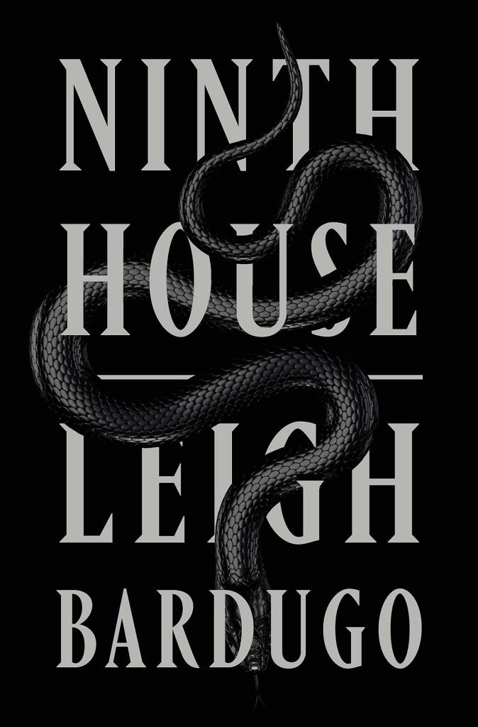
1. High-contrast color and simple graphical elements.
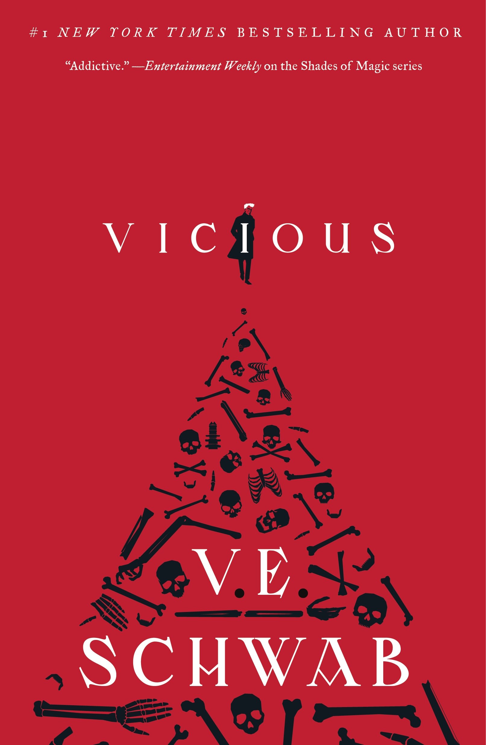
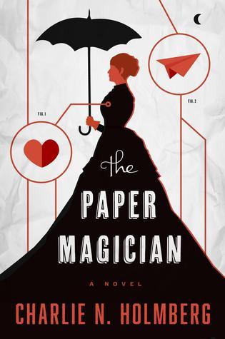
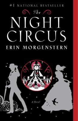
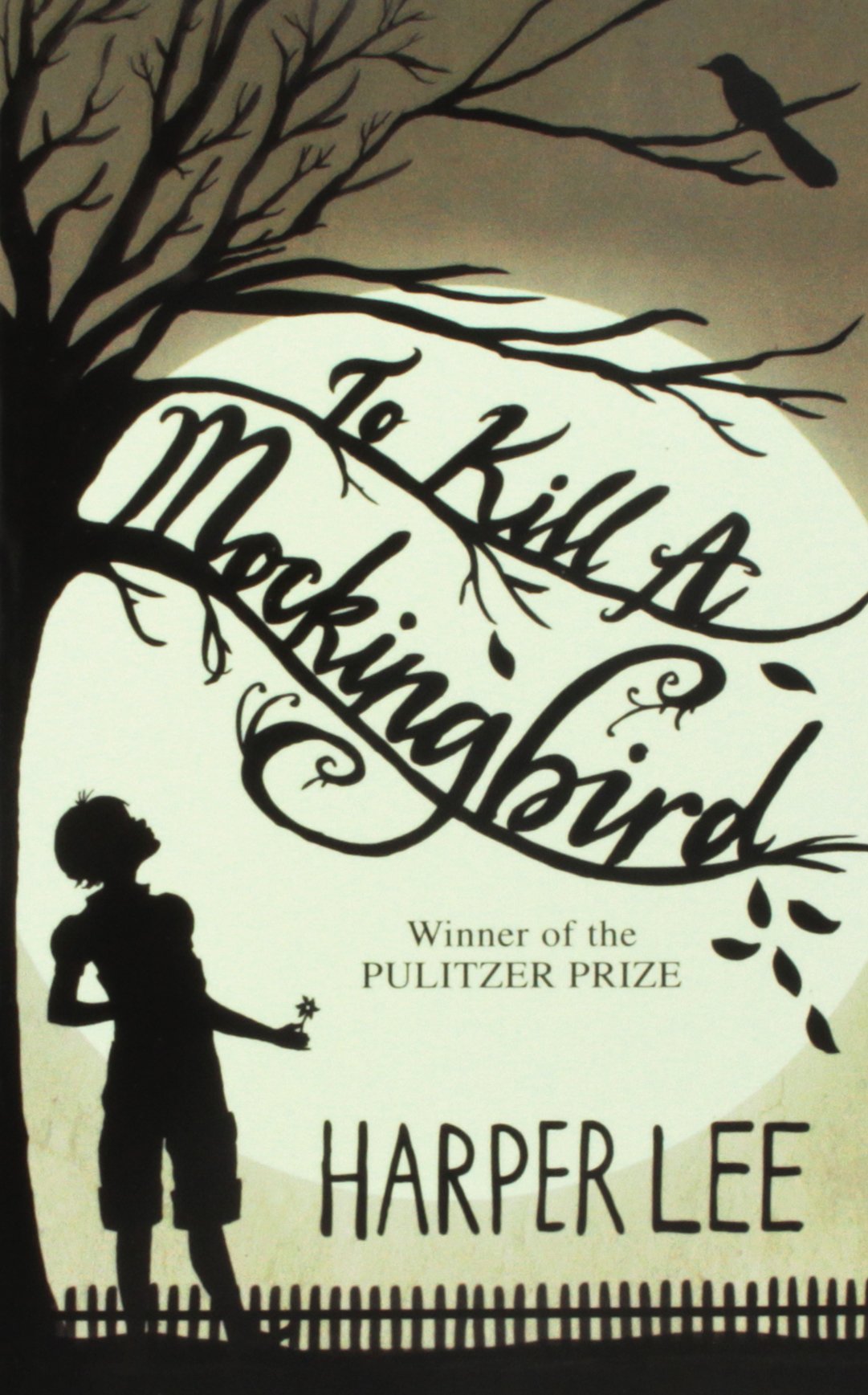
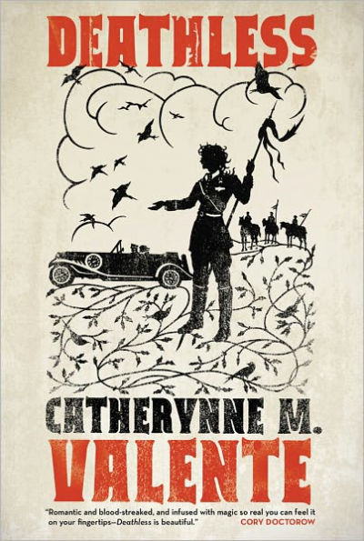
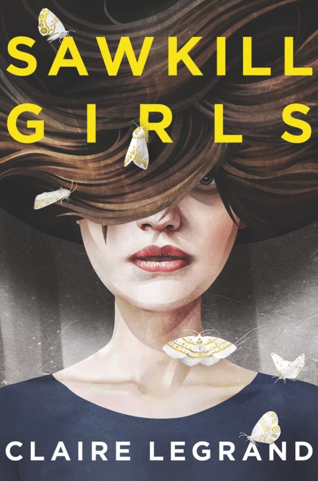
2. Silhouettes.
This is related to #1, but can be used in a more complex design and I still dig it.
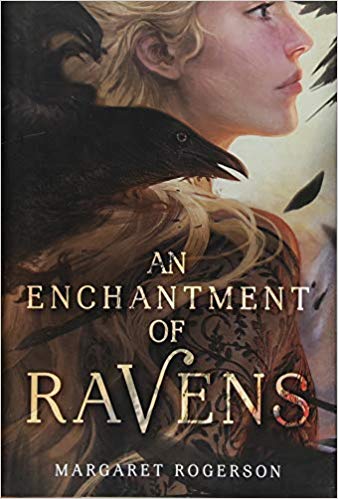
3. Text that interacts with other visual elements.

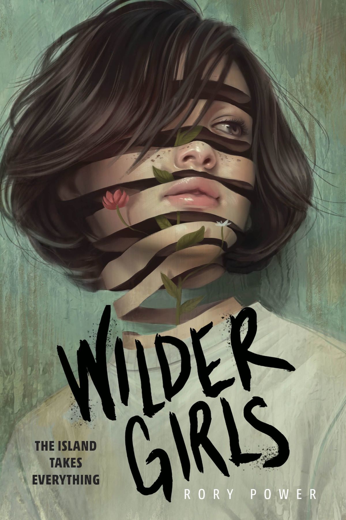
4. Painterly covers.
I love that these are making a comeback.


Rant: Cover Design Trends I Hate
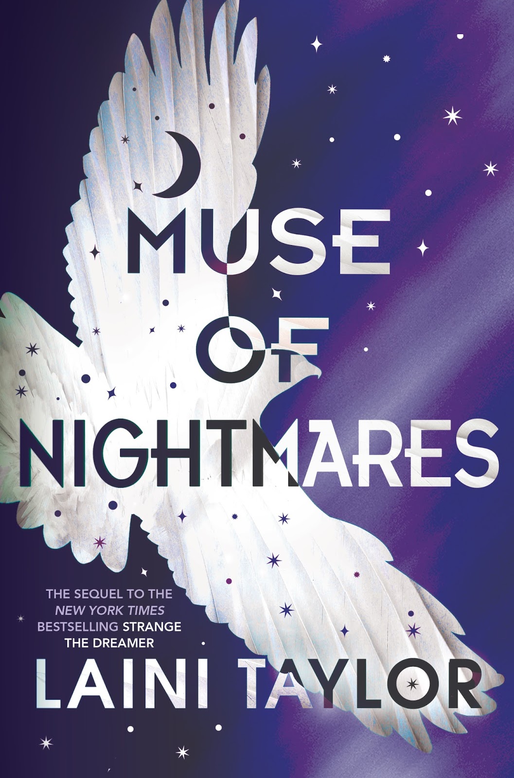
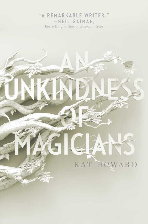
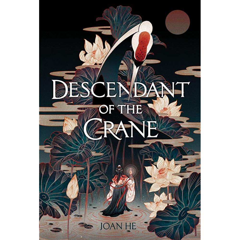
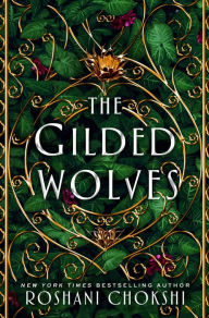
1. Text-focused covers surrounded by decorative elements.
I get it… these designs are a bit more subtle. Often you can find little symbolic things related to the story in the decorative elements, but I want a cover that tells me something about the book’s content and atmosphere at a glance.


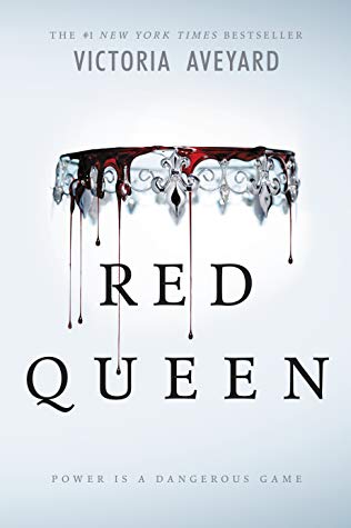
2. Crowns.
I know, this is very specific, but there’s been a plague of crowns in recent years. And it’s starting to get to the point where it’s hard to tell them all apart.


Okay, so it looks like I actually have more raves than rants, but that’s a good thing, right?
What book covers give you heart-eyes? Which design trends do you hate?
