4. Professionalism
This is a pretty nebulous concept. In general, does it look like someone with thoughtfulness and skill designed this cover, or does it look like someone with no previous experience used a “make your cover” template?
For those who are designing your own covers on a budget and don’t have access to fancy software, I recommend GIMP for editing. It’s free, and has some of the features you’d get from a program like Photoshop. It is not the most immediately intuitive program, but there are tutorials available and you can make a pretty decent cover with it if you’re deliberate about the design concepts listed in this series.
Font Choice and Text Layout
The easiest and quickest technique for looking professional is thoughtful font choice and type placement.
If I see a cover with a poorly-aligned, poorly-spaced title in Times New Roman or Calibri, I know the author didn’t spend a lot of time on the text layout. See the examples below.


There are thousands of gorgeous, professional, legally-free fonts on FontSquirrel; select something just a little unique, but still legible.
Some of my favorite fonts to get you started: Bebas, Raleway, Questa, Cooper Hewitt, Droid, Lintel, Junicode, Verve (which is actually on DaFont.com, but as a general rule their fonts aren’t as complete or professional as FontSquirrel).
Also, give your title decent margins between the text and the outside of the page. Let it breathe. If it’s too close to the edge, the text can feel crowded. Sometimes, you can deliberately touch or bleed past the page, as in the example above, but use this thoughtfully.
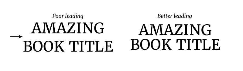
Pay attention to the space between lines if your cover contains two lines of text. Too much space makes it look like you’re using a default setting. This is called “leading” and there are settings for it in Photoshop, InDesign, and Illustrator. I don’t know if GIMP has them, but you can manually fake it by using two separate text objects and moving them around.

If your title is more than one line, it can help to vary the spacing, the size, or the typeface. See the example on the left. Using two separate title fonts allows for visual interest on “We Are Monstrous” and makes it look more professional.
Kerning and Tracking. These are fancy words for “the space between the letters”. Kerning refers to the gap between individual letters, while tracking is the spacing in a group, as a whole. On this We Are Monstrous example, my author name “Avery Ames” has wide tracking, with a lot of space between the letters. This is my best quick-and-dirty trick to make your text look classier, but is really only effective with all-caps text. Again, professional software has tracking options, but you can also fake it by placing a space between each character.
Kerning is fiddlier, and you’ll probably only be able to do it in more powerful programs like Adobe Creative Suite. Some fonts just put too much space between certain letter pairings. The dreaded combos of “A”, “V”, and/or “W” are notorious for this; some font files leave a large gap as in the example below. Professional designers will manually adjust the spacing between every letter of your title so there are no distracting gaps or crowded spots. If you have software that will let you do this, please do so. It can make all the difference.
Images:
Another aspect of professionalism is image choice. It comes down to that vague definition of “classy vs tacky”. This definition varies from person to person, but in general, does the imagery look professional? A low-quality CGI illustration or a low-resolution image with obvious jpeg artifacts can do more harm than good, when a well-placed stock photograph or even just a nice background pattern and decent lettering would have done the trick instead.
Pixabay and PXHere are two great sources of 100% legally-free photographs and illustrations if you’re on a budget. If you’ve got a bit of money to spend, sites like Shutterstock and Fotolia will sell images on a one-by-one basis and have huge libraries of high-quality photos.
Bottom Line: Pick imagery that looks professional. Be particularly thoughtful about your type layout and font. Text is the #1 giveaway between a professional cover and an amateur one.
Tomorrow is our last lesson: Be Unique (But Not Too Unique)!
